Compare?

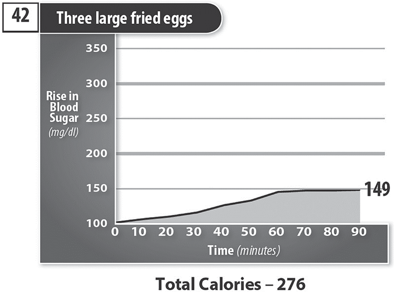
Compare three large fried eggs {Ron-graph 42} (lots of fat) to one cup of Special K cereal with fat-free milk {graph 12} (no fat).


The shaded area in the graphs show weight gain and how hard your pancreas must work to produce enough insulin to bring your blood glucose (Blood sugar and blood glucose are used interchangeably in common usage. Blood glucose is the more medically correct so I use that more often.) A larger shaded area contributes to Type 2 Diabetes and weight gain. A smaller shaded area helps you reverse Type 2 Diabetes and lose weight. The slope of the graphs shows how fast the blood sugar is raised. A fast rise is bad because it turns to body fat before you can burn it. A slow rise is good because you have more time to burn it before it becomes body fat. Remember this: If you control your blood glucose, your control your weight. Note: The information on these and other graphs you will see are based on more than 80,000 blood-glucose tests I have given myself over the past 40 years.